


The Problem
The Problem statement
Boost Mobile’s activation experience was fragmented across four web flows and a separate app flow. Customers had to choose the “right” path, and engineering maintained five versions of the same journey. This increased cognitive load, introduced errors, and drove support calls.
4 fragmented web flows and an isolated app flow that made users choose a path and forced engineering to maintain five versions.
To measure our success, the following goals were established:
Raise Activation OSAT to
78%
Improve instruction clarity to
83%
Reduce support dependency by
30pp
Intro story time
I encountered this problem firsthand as a customer. I documented the gaps, validated them with data and research, and began building alignment across Product, CX, and Architecture. What started as exploratory work became a company-wide activation redesign.
The Research
cognitive walkthrough
I started with a cognitive walkthrough of every flow and its most common use case. I wanted to see where friction really lived, not in theory but in the path a person would actually take. Entry points immediately stood out, web versus app, then four separate web entries that branched again. In my UX opinion, too much of the mental load was on the user, not the system. I mapped out the flows to see how many times the flow branched. This confirmed that the system was pushing decision-making onto users instead of guiding them.
Entry points were a maze.
Four web entries, one app, zero clarity.
Users carried the mental load.
what does the data say?
I then went into Quantum Metric to watch session replays and timing. Yes, IMEI and ICCID were tricky, but the bigger wall was porting. Many people stalled there and ended up calling care. Each call has a real cost. (I’m not sharing the amount, but the business wants fewer of them, obviously.) The data showed that porting was not just confusing, it was the primary trigger for abandonment and support calls.
IMEI and ICCID were bumps. Porting was the wall.
Replays showed stalls at porting that turned into care calls.
Care calls cost money. Reducing them matters.
Talking to subject matter experts
After my own walk-throughs, I pulled OSAT survey comments and waterfall data from our UX researchers to cross-check what I was seeing. Finally, I spoke with our solution architects and porting SMEs about what could actually change. Authorability came up quickly. AEM authors could own copy, instructions, and error states. This was a big lever for fast iteration. Those conversations built alignment around one flow across web and app. These conversations revealed a critical lever: content and error states could be owned by AEM, enabling faster iteration without engineering dependency.
had issues porting their number over to Boost Mobile
23%
fallout rate reported with users dropping off the activation flow
10%
Activation OSAT report suggesting room for improvement
70%
Defining Scope
With the picture clearer, I ordered the work by impact and feasibility.Porting screens first. Fallout here was 23%, and the step was overwhelming.Confirmation second. OSAT showed uncertainty, especially for eSIM, about whether activation succeeded and what to do next.UI updates third. Years of quick fixes had eroded trust. A unified look and clearer instructions and errors would lift confidence.Entry points last. It was the most complex, but it would truly unify the journey. Prioritizing this way reduced the biggest pain quickly and set up the foundation for the heavier unification work.
1
Porting screens due to highest fallout
2
Confirmation screens as quick win
3
UI Updates as a necessity
4
Entry points as the main friction
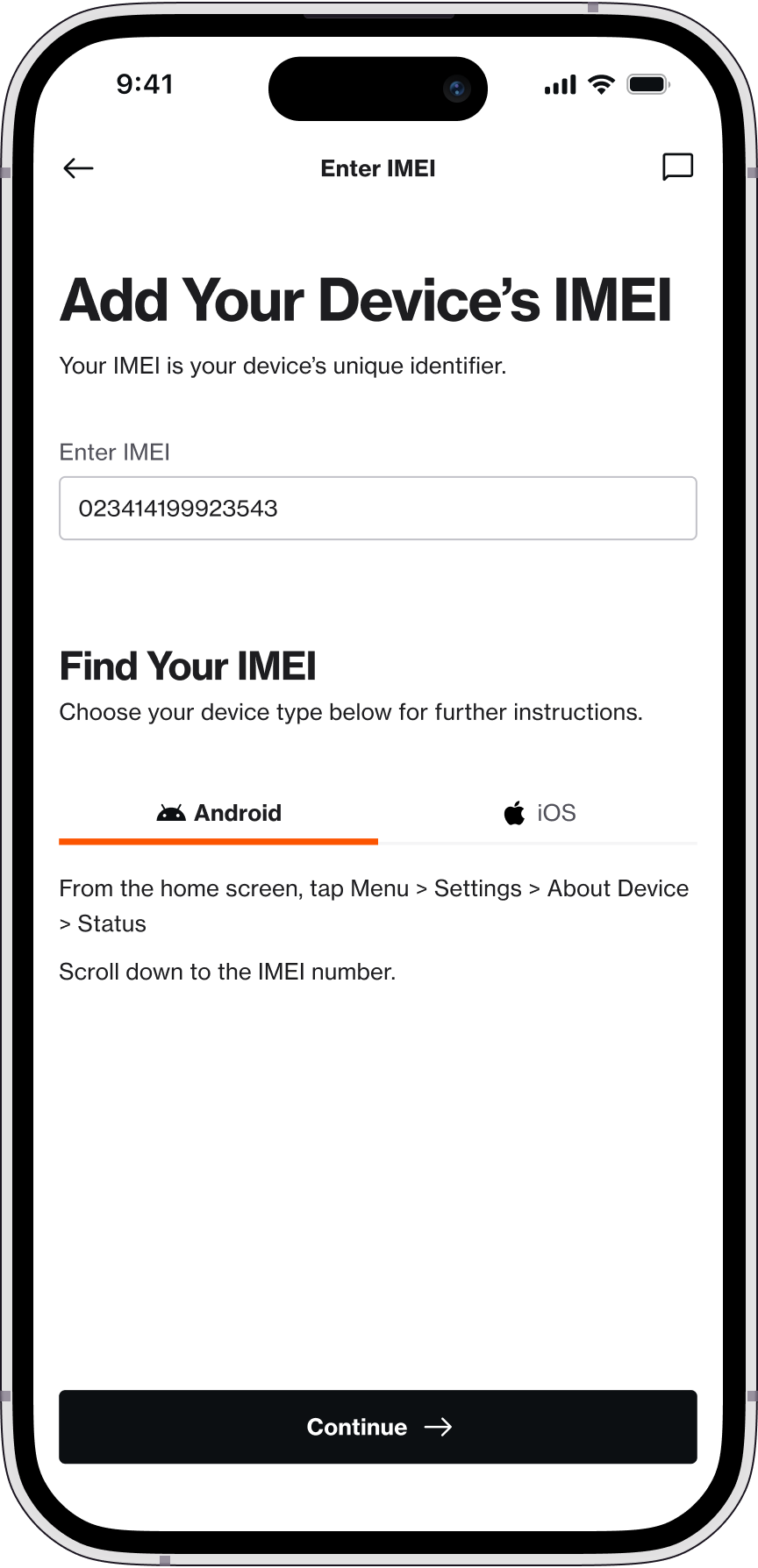
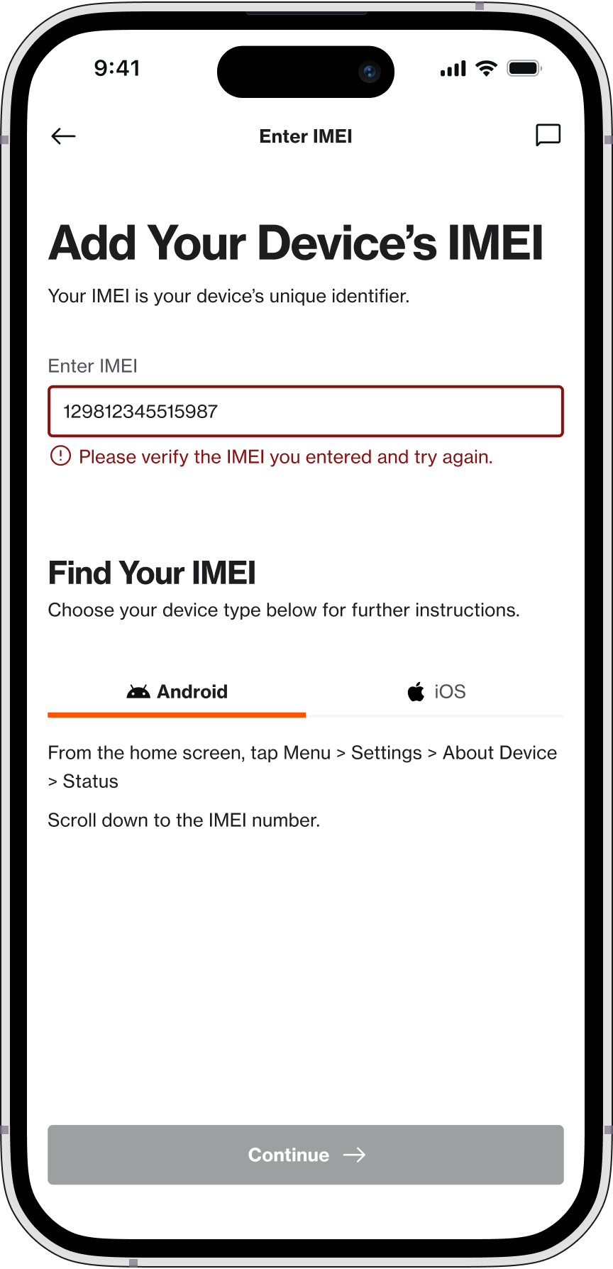
The Designs
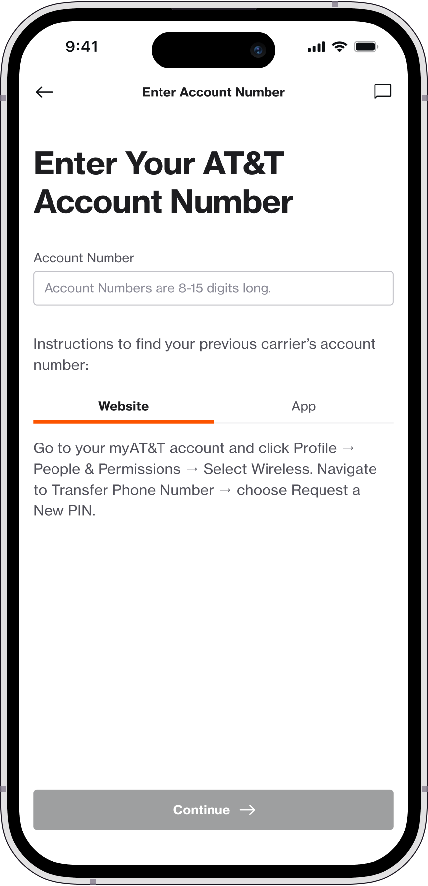
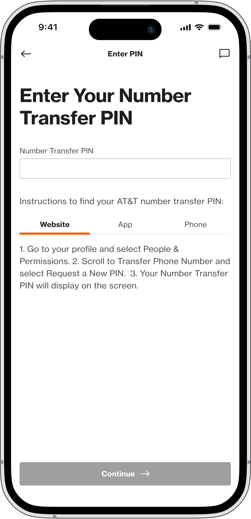
porting screens
For porting, the original design was a single long form. I mocked a one-page version and a stepwise version and ran a UserZoom test. Testing showed a clear preference for a stepwise flow. However, splitting indiscriminately increased friction. I grouped fields by mental model (identity, account, device) so progress felt meaningful rather than fragmented. Keep what belongs together, such as name and address, and avoid the “everything at once” wall. People do not activate phone service every day, so the UI has to carry the memory, not the user.
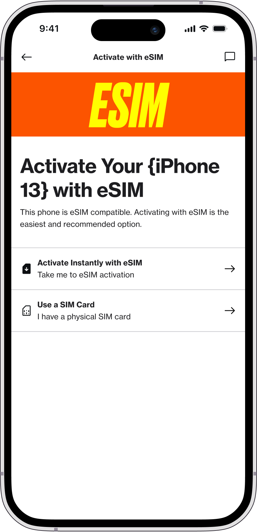
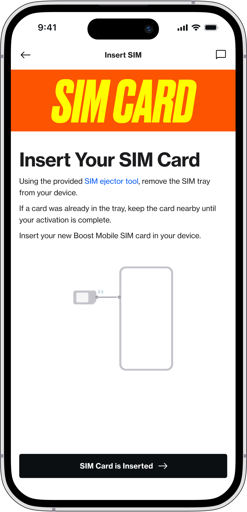
confirmation screens
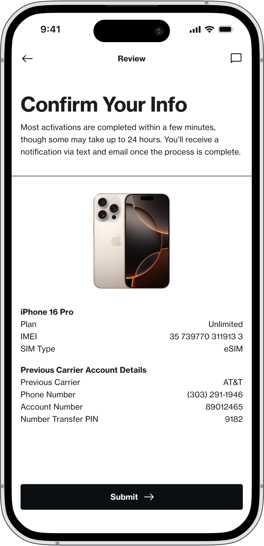
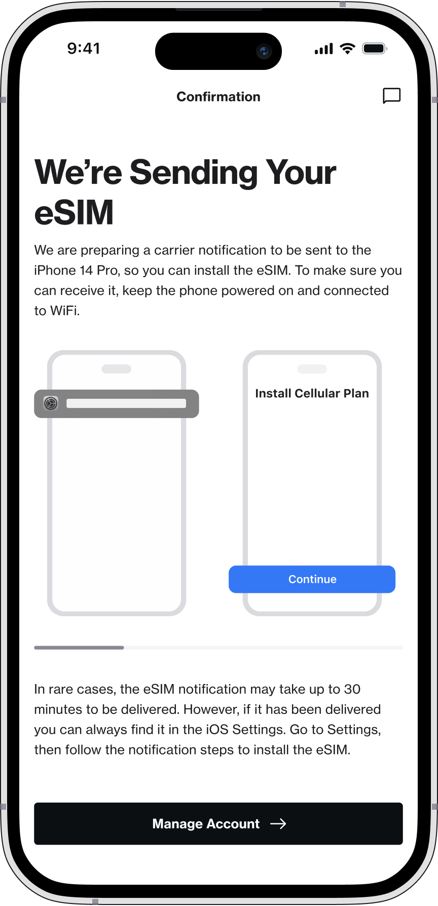
For confirmation, I made success unmistakable and set expectations. In most cases activation takes two to five minutes, and in some cases it can take up to twenty-four hours. For eSIM, I included the download and install steps so the journey does not stall right after “success.”
Given that activations could be a combination of any SIM type (eSIM or pSIM), any phone number (new number or transfer number), any device type (apple or android or tablets) and any channel (digital or national retail or apple retail or amazon) and any customer type (new or existing). I had to ensure that we are closing the loop on their individual experiences.
For that reason, I had to come up with almost 20 variations of the confirmation screen. Using Figma's component and variant features were a crucial piece of the designs here.
ui updates
For UI, I brought instructions to the surface and made error states explicit, then applied branding consistently across screens. Small changes here do real work. Clarity builds trust.
Entry points
For entry points, I stitched together very different realities.
Shell accounts from Apple Retail and some Amazon orders, where we already had customer data.
Unknowns, where accounts are created after activation.
Cases where people needed to purchase first before continuing.
Shell accounts from Apple Retail and some Amazon orders, where we already had customer data.
Unknowns, where accounts are created after activation.
Cases where people needed to purchase first before continuing.
The goal was one clear entry and a consistent login for everyone, with plan selection and checkout woven in at the right decision points. One more gap surfaced from national retail. After finishing one activation, customers could not activate another line there. They had to go online. Fixing that final piece meant the flow was truly complete.

design system
To keep this maintainable, I built a pattern library on top of our design system. One place for multi-state screens meant faster iteration and fewer mistakes. I also created a content variables library for copy, instructions, and errors. Change the content once, publish, and every pattern inherits it. Designing and updating became simple, fast, and reliable.

Testing
I ran two unmoderated studies to verify the design.
quantitative Testing: userzoom
In the redesign, clear CTAs were added to allow different end-users quick access to the desired information; the overall navigation of the site was condensed and made available via the main navigation bar; and lastly, a photo gallery, testimonials section, and contact us form were added to help instill confidence in the site and help answer initial questions.
qualitative Testing: userzoom
I captured think aloud reactions and per screen opinions. Several participants asked for a progress indicator. I recommended a progress bar. It was considered out of scope for this release and moved to a different project.
Conclusion
the impact
Unified Activation transformed one of Boost’s most fragmented, high-friction journeys into a single, scalable experience that drives both customer success and operational efficiency. The results show clear, measurable gains across satisfaction, completion, and support dependency.
Reduced reliance on support: The redesigned onboarding flow lowered customer support usage by 38 percentage points, enabling far more users to complete activation independently.
Stronger first-time experience: Activation OSAT increased from 70% to 80%, reflecting higher confidence and clarity during a critical first interaction.
Clearer guidance at key moments: Instruction clarity OSAT improved from 77% to 84%, reducing stalls and hesitation during setup.
Stronger first-time experience: Activation OSAT increased from 70% to 80%, reflecting higher confidence and clarity during a critical first interaction.
Clearer guidance at key moments: Instruction clarity OSAT improved from 77% to 84%, reducing stalls and hesitation during setup.
Core activation metrics are trending upward as fragmentation is replaced with a single, coherent journey. By shifting cognitive load from the user to the system and removing decision points that previously caused abandonment, Unified Activation increased completion, reduced friction, and established a foundation for scalable growth.
next steps
Build on the framework. After training AEM authors on the file structure, we can ship copy updates fast for instructions and error states. Progress bars are designed and ready to be developed as a follow-on.
reflections
This was my first project at this scale. The dependencies were significant and keeping leadership aligned and excited required steady communication.I owned the work from conception to delivery and served as a stand-in product manager during a large portion of the project due to staffing constraints.What I took with me: see the product as a customer, make the system carry the complexity, fix the biggest friction first, then unify the edges. A pattern library plus content variables turns a redesign into a maintainable system
in conclusion
I am very grateful for the opportunity to work on this project and be able to create a finished piece that will have a positive impact on people’s lives.
